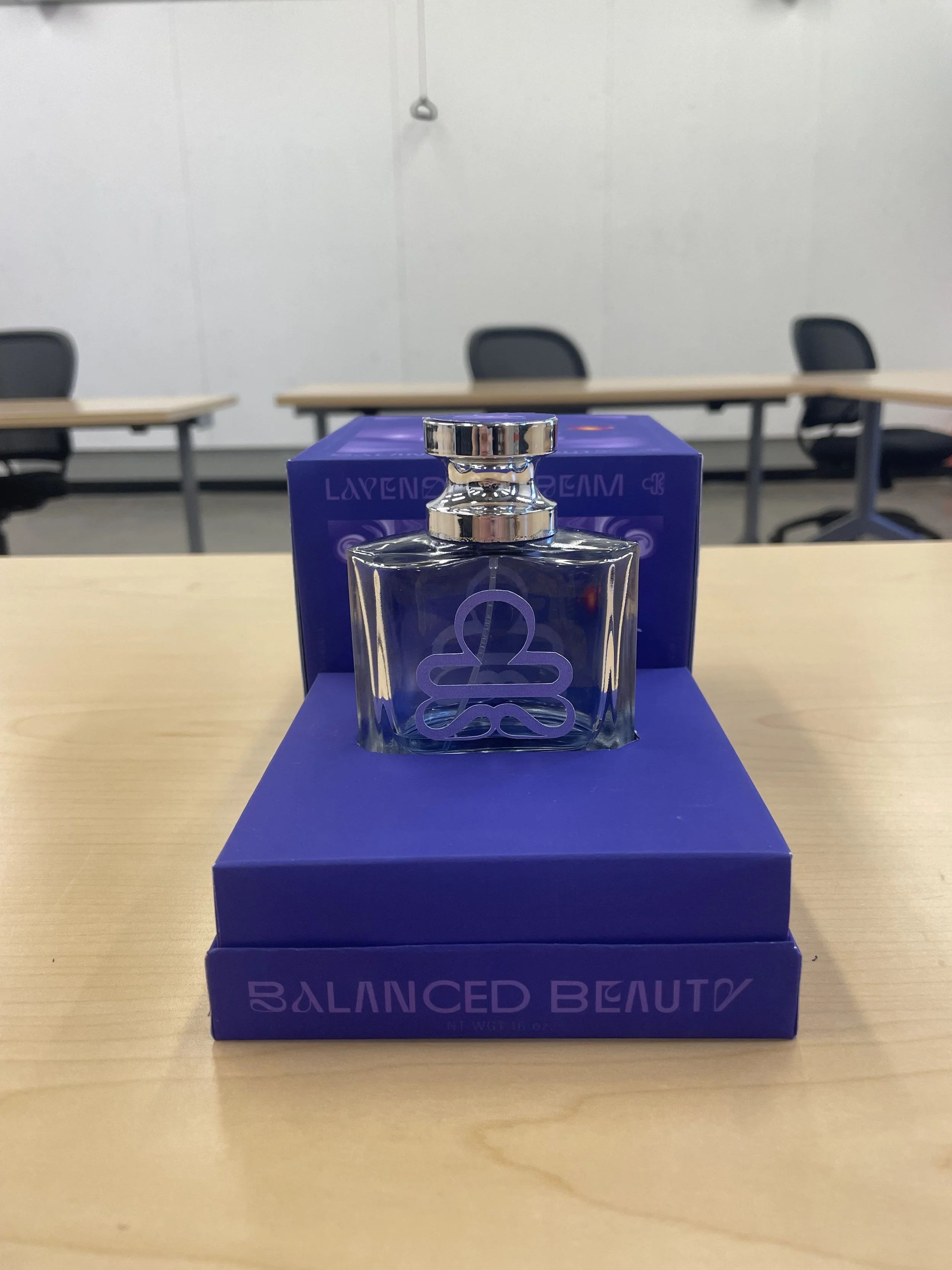
Perfume package design
In my package design class, I was tasked with creating a zodiac-themed perfume package. I developed "Balanced Beauty," a luxury perfume brand inspired by the Libra zodiac sign. The brand embodies femininity, refinement, and intellect, with a design aimed at evoking a transition into a dimension of confidence, passion, and comfort. The packaging strikes a balance between luxury and approachability, while also visually represents the fragrance’s notes of lavender, cedarwood, and cinnamon, combining their calming, grounding, and invigorating qualities into the design.The logo combines the two mirrored “B”s of Balanced Beauty with the iconic Libra zodiac symbol, seamlessly merging brand identity with astrological inspiration.

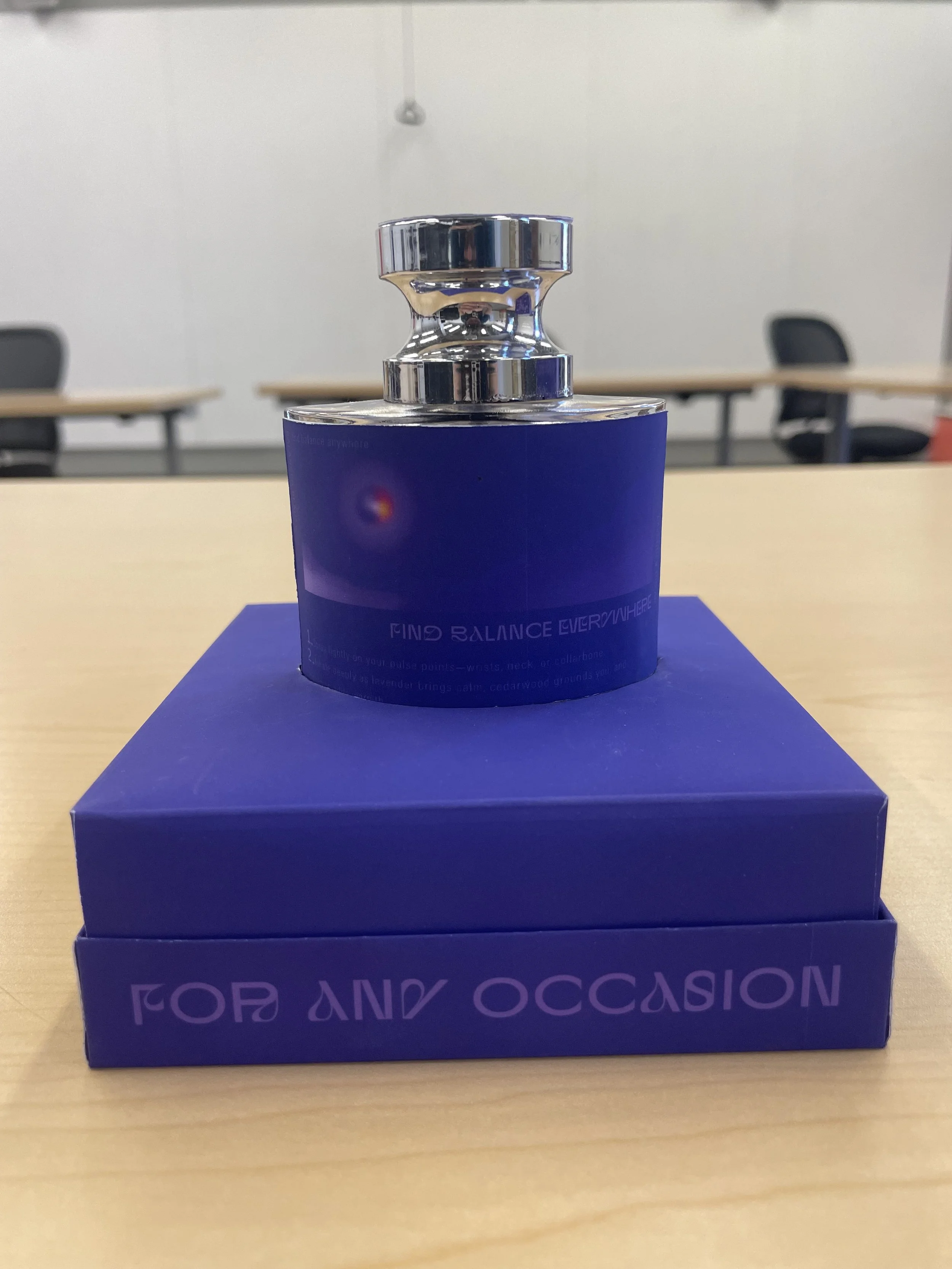
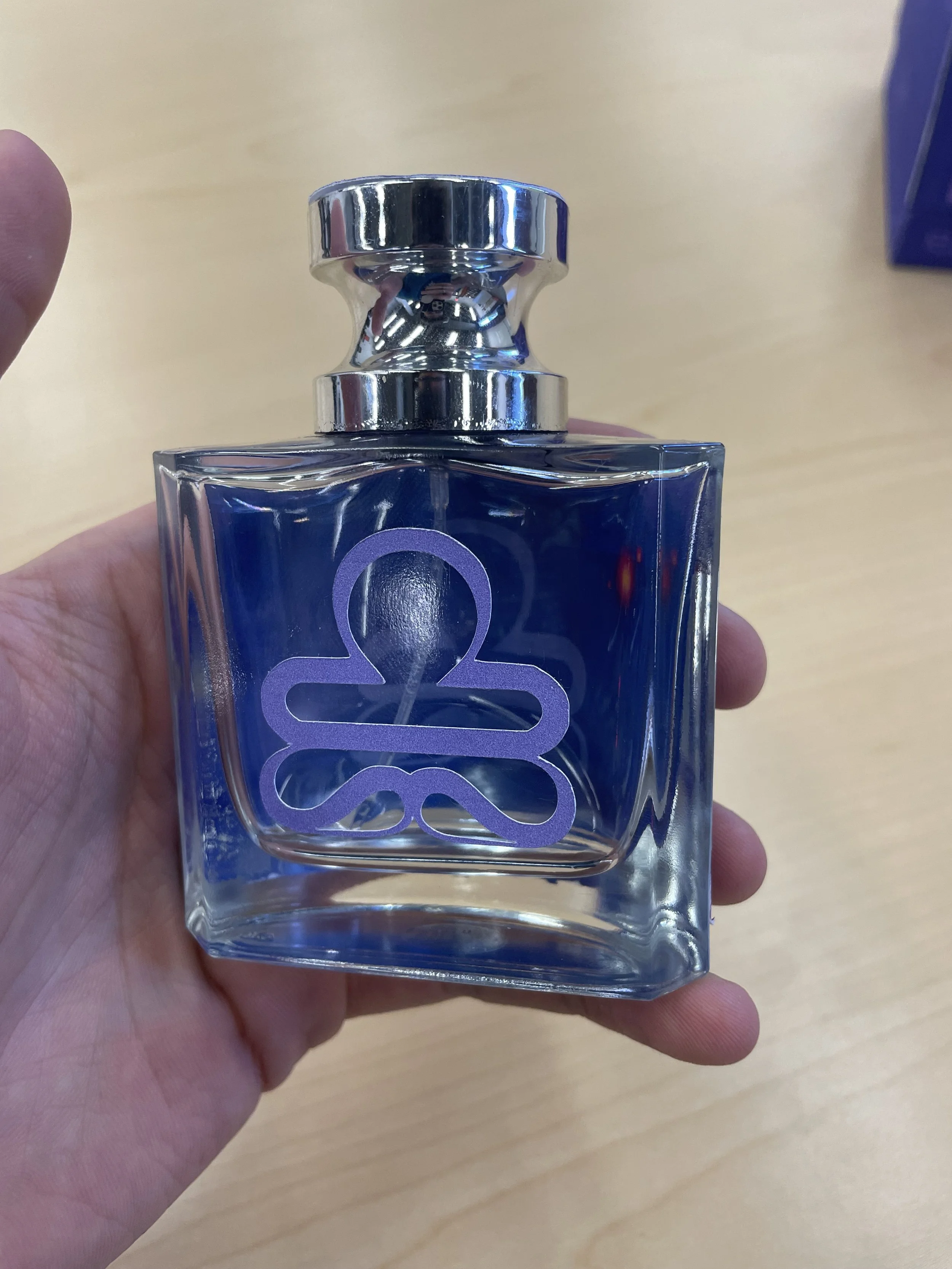
Bottle
The bottle’s design aims to embody the themes of balance, comfort, and confidence. It stands proudly and effortlessly within a compact plinth. A secondary graphic, positioned on the inner back of the bottle, enhances its visual intrigue, creating a layered and immersive experience that complements the surreal quality of the packaging.
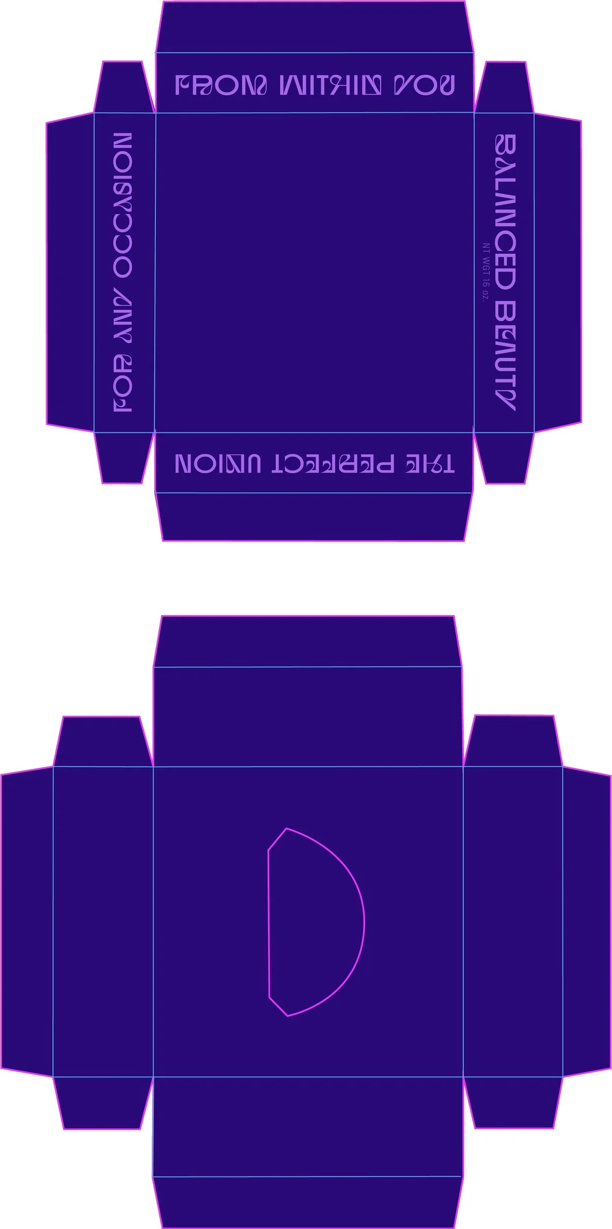
Dieline and intention
For the box design, I opted for a “box within a box” concept to hold the perfume, creating a platform that the cover could seamlessly slide over. Precision in measurements was crucial to achieve two goals: a) ensuring a smooth, seamless opening experience, and b) allowing the box top to rest perfectly atop the bottle, providing a solid, stable, and secure feel to the packaging. As the main themes of this brand are confidence, balance, and comfortability, it was of the utmost importance to consider those elements in the unboxing and handling experience.